
I ❤️ Branding

Having a marketing background, I've always loved branding especially if you happen to own a small creative business. I fortunately have a nickname "Chu Chu" that lends itself to work well as a business name that I love and likely will never get sick of!
My geometric mountain design has followed me from my early days of pottery so it seems suitable (and recognizable!) as part of my logo. Since those early days I've branched out from selling jam, cards and pottery, to teaching more and also creating Life-Size Colouring Murals. All of which carry my brand and logo in different variations.
Let's start with my first logo:

Oh boy, I mean, it's cute in a country fair kind of way hey? I was once obsessed with canning and preserving thus the mason jar seemed to be my "thing" at the time. I still think it's charming but certainly doesn't encompass the variety of side hustles I have now.

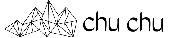
Next version: this is when I started selling pottery and I had my iconic Geometric Mountain design on my wares and decided it would be fitting on my logo. Kept the same font and stuck with black and white since all my ceramics follow the same colour scheme.


And now the current logo situation, my theme that just happened to work out perfectly is to name each branch of my business starting with a "C". Rolls off the tongue well, looks nice visually and is easy to remember. I changed the font to something that is more bold and is more clear at a smaller size and from a distance.
And yes, I added colour for the first time! Which brings me to my next decision on labels and stickers.
 I used to always print my own labels using either Kraft or white paper. Kraft labels always seemed the most cost effective and since I was using Kraft coloured bags anyways, it was a good fit.
Supply chain has been an issue for all of us but I am slowly starting to make the switch to black bags to make my logo pop more.
StickerCanada contacted me before the new year and asked if I would like to try out one of their products in exchange for a blog post to see if it's a good fit for my art business.
I decided to give it a go and ordered their Hologram stickers, right out of the package they seem to be a muted silver colour but holy moly, take em out in the light and it's a prismatic rainbow!

They are obviously a million times better in quality than my at-home-printed labels, the print is nice and solid and the backing is sticky, something that my Kraft paper lacks.
The rainbow effect is much stronger than what they even display on their site which seems a bit more pastel.
When I print my own, I am able to use different variations of my logo because there is no quantity commitment.
However, when ordering a commercially made batch, I chose to just stick to the product name so I can use it with all my business streams.
The photos make the product look great, but check out my video to see the full effect here.